Taking apart one of our homepage prompts, and the phrase that was quietly breaking it
A red rim-light portrait from our homepage, split into its seven parts, rerun with one change at a time on FLUX.2 [pro]. One phrase turned out to be drawing a neon line across her face.
Jaxson McNeil
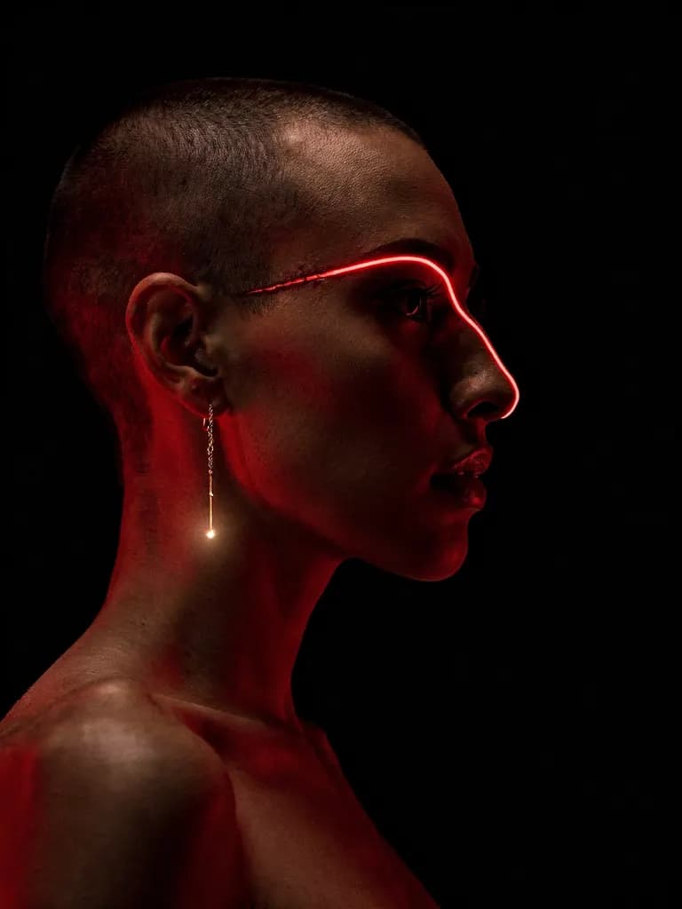
This portrait is one of the images we picked for the Increation homepage. It was made on FLUX.2 [pro], which costs 30 credits an image, and it does what a homepage tile has to do: it reads as a shape from across the room.
We wanted to know which words in the prompt were doing the work. So we split it into parts, changed one part at a time, and ran each version twice on the same model at the same 3:4 shape. That's 14 new images, plus 8 from an earlier square test we mention where it adds something.
Look closely at the original before you scroll. There's a red line running across her eyebrow that no real light would draw. We'll come back to it.
The prompt, part by part
Prompt
cinematic film still, stylized portrait: a shaved-headed woman in strict
profile against pure black, a single scarlet rim light tracing forehead, nose,
and jaw, gold thread earring catching the light, everything else falling to
shadow, decisive graphic silhouette legible at thumbnail size, graded crimson
and black
"cinematic film still, stylized portrait:" sets the medium before anything else. It asks for a frame from a film rather than an illustration or a stock headshot. We use the colon to mark everything after it as the description of that frame.
"a shaved-headed woman in strict profile against pure black" is subject, pose and ground in one go. "Strict" is there to stop the head turning towards the camera. It held in every run we made.
"a single scarlet rim light tracing forehead, nose, and jaw" is the lighting, and the part of the prompt we'd now rewrite (more below).
"gold thread earring catching the light" is the one warm accent. Every run we made kept the earring, and it's often the only thing in the frame that isn't red or black.
"everything else falling to shadow" is an exposure instruction. It stops the model filling in a shoulder, a background, a second light.
"decisive graphic silhouette legible at thumbnail size" is a statement of purpose. We wrote it because the image would sit in a small tile. It pushes towards a big, simple shape.
"graded crimson and black" is the colour grade, the same way you'd describe a LUT to a colourist.
Two runs of the original, for a baseline
Before changing anything we reran the prompt untouched, twice. That tells you how much an image moves when you change nothing at all, which is the noise floor for every comparison below.

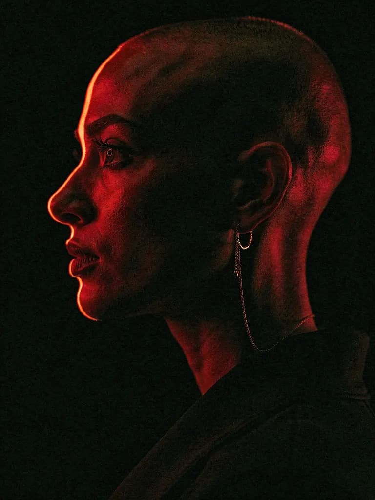
Same woman, more or less, same pose, same palette. The first rerun has the red line across the brow again. The second doesn't: there the light sits on the edge of her profile, the way a rim light actually behaves.
Change the lighting
We swapped the rim light for "soft window light falling across the front of her face from the left" and the grade for "warm grey and black". Nothing else changed.

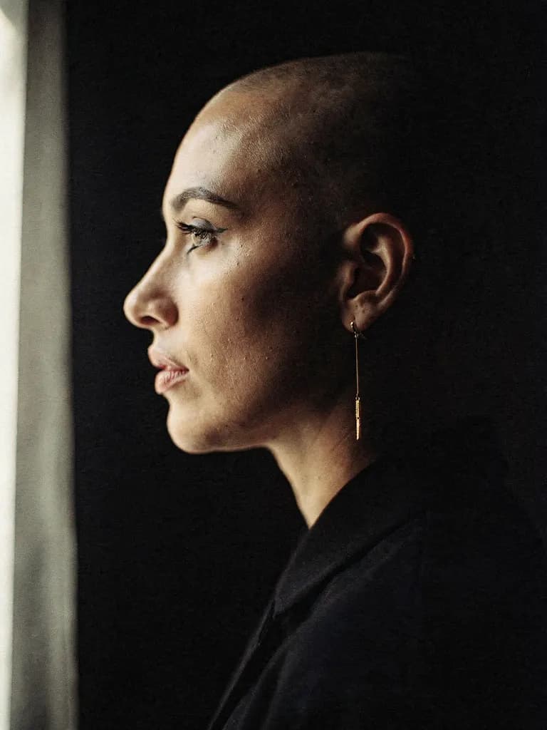
This was the biggest change of the four by a distance. The graphic poster became a quiet portrait. She has a face now instead of an outline, and both runs put a strip of window at the left edge of the frame. Lighting is the part of a prompt that decides the mood, and here it decided almost everything.
Change the lens
We added "shot on a 24mm wide-angle lens from close up" after the opening phrase.

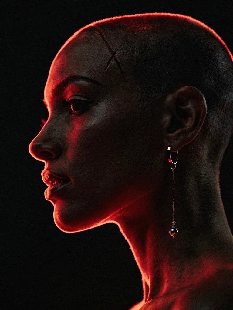
Almost nothing happened. A real 24mm lens that close would stretch the nose and push the ear back. We got neither, in two runs here and two more in an earlier square test. The second run here added a strange cross-shaped mark on her scalp.
Our read: on this model, with a prompt this full of lighting and style words, a focal length on its own does very little. If you want the wide-angle look, describe what it does ("nose close to the camera, ear small and far away") rather than naming the lens.
Change the style
We replaced "cinematic film still" with "charcoal drawing on toned paper".

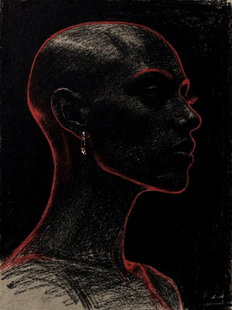
Both runs are convincing charcoal, with paper grain and smudged blacks, and both kept the red outline and the earring. So the medium swapped cleanly while the composition carried over intact. In an earlier square run of the same change, one image came back with a scribbled artist's signature in the corner. Check the corners of anything you generate in a drawing style.
Change the subject
We swapped "a shaved-headed woman" for "an old fisherman with a white beard".

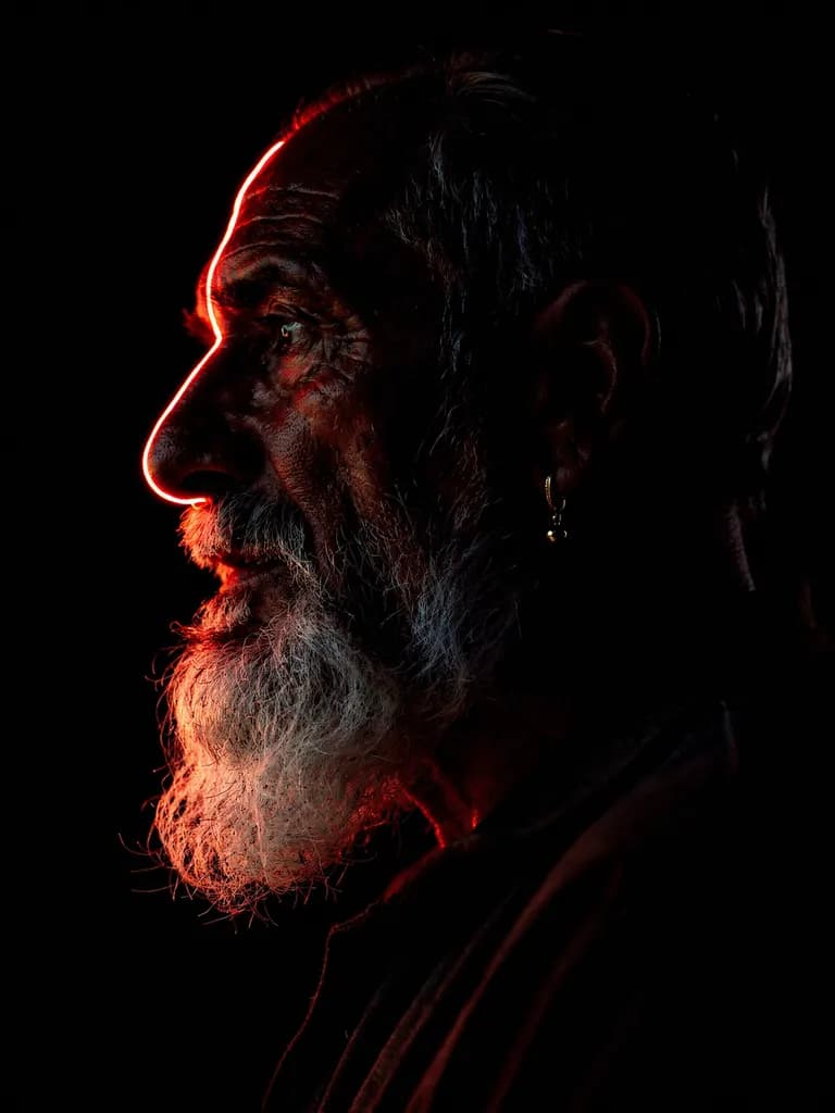
The lighting, grade and earring all carried across. The beard catches the red light better than skin does, which makes these some of the strongest images in the set. The first run has the red line across his forehead again.
The phrase that was drawing on her face
Count the red line. In the eight runs that kept the original lighting words, four had it: one of the two baseline reruns, and one of each pair for lens, style and subject. The homepage original has it too.
Our suspect was the phrase "tracing forehead, nose, and jaw". It describes a line, so sometimes the model draws one.
We changed that one phrase to "a single scarlet backlight from behind her, outlining the edge of her profile" and ran it four times.


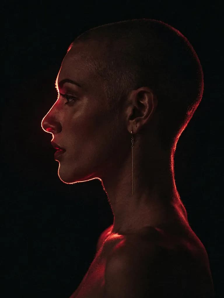
None of the four had the line. The light now sits where a backlight would put it, along the edge of the head, nose and lips. We changed the whole phrase at once, so we can't say whether "tracing" alone was the culprit, but the fix is what matters.
What we'd tell you to take from this
Describe light by where it comes from, not by the shape you want it to make on the subject. "From behind, outlining the edge" got us a real rim light four times out of four. "Tracing forehead, nose, and jaw" got us a neon brow about half the time.
Spend your words on lighting first. It moved the image more than lens, style or subject. And run anything you care about at least twice before you decide a word works, because one of our two untouched reruns had the flaw and the other didn't.